Final Project: Serially looking at your Cereal Choices
Hi everyone!
Almost everyone starts their mornings with a nice bowl of cereal. In the grocery aisle, you choose a box of cheerios and chocolate puffs. However, your decision to buy that cereal may not have been completely your choice at all. You just picked from the options that were conveniently placed in front of you. My project will analyze the relationship between the shelves cereals are placed on to the sugar, fiber, and calories of that cereal. Do the ingredients of cereals, either healthy or sugary, play a role in what shelf cereals are placed on and their ratings?
Two Part Analysis
- Do the ingredients sugar, calories, and fiber content have a true mean difference with that cereal's placement on shelf 1,2, or 3 (counting from the ground)?
Null Hypothesis: There is no significant true mean difference between the ingredient and the shelf number of the cereal.
- How are these cereals rated based on the ingredients that are significant for the placement on shelves? Is the rating higher for unhealthier cereals?
My data is from http://lib.stat.cmu.edu/datasets/1993.expo/. This is a "multivariate dataset describing seventy-seven commonly available breakfast cereals, based on the information now available on the newly-mandated F&DA food label" (StatLib). My modified data set includes the variables I am testing: cereal name, sugar, fiber, calories, and ratings.
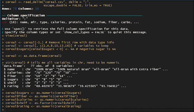
Step 1: Import and Clean Data Set
Step 2: Descriptive Statistics to understand data
I notice the number of cereals on each shelf increases as you go up. This is an interesting aspect to analyze to see if any of these ingredients have to do with the placements.
Step 3: Sugars Analysis
Boxplot of Sugars v. Shelf
From the boxplot, we can see shelf 2 has the highest median sugar content. By using tapply, we can see the mean of sugar in each shelf. It is evident shelf 2 has a much higher mean sugar (9.61).
The ANOVA analysis shows a p-value of 0.00232 which is significantly less than a standard alpha level of 0.05 and a F value of 6.601. These results help us reject the null hypothesis and therefore say there is a true mean difference between sugar content in the cereal and where it is placed on the shelves. Since our null hypothesis is rejected, it is important to do a Tukey Post test to see exactly how much sugar affects the shelf number.
Step 4: Fiber Analysis
Boxplot of Fiber v. Shelf
The boxplot indicates the median fiber is highest in shelf 3 with a couple of high fiber outliers. Shelf 2 has the lowest mean fiber. The mean is highest on shelf 3 at 3.13.
The ANOVA analysis shows a p-value of 0.00116 which is significantly less than a standard alpha level of 0.05 and a F value of 7.417. These results help us reject the null hypothesis and therefore say there is a true mean difference between fiber content in the cereal and where it is placed on the shelves.
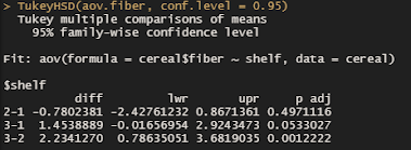
The Tukey Test tells us the difference in means is greatest between shelf 2 and 3 at an adjusted p-value of 0.001. This confirms our boxplot that told us cereal with higher fiber is on the shelf 3 significantly more than 2.
Step 5: Calories Analysis
Boxplot of Calories v. Shelf
This boxplot is interesting since the median of shelf 2 and 3 is similar for calories but the distribution range is higher for shelf 3. The mean is higher on shelf 2, however, at 109.5.
The ANOVA analysis shows a p-value of 0.485 which greater than a standard alpha level of 0.05 and has a very small F value of 0.732. These results do not allow us to reject the null hypothesis and therefore we cannot say there is a true mean difference between calories in cereal and where it is placed on the shelves. We do not need to do a Tukey test.
Discussion
After completing analysis on each ingredient, we can see sugar and fiber are the two from this study that are playing an important role in deciding where the cereal is placed on the shelves, either on the floor (1), eye level mostly for kids (2), or adult level (3). Sugary cereals are purposefully placed on more on shelf 2, which makes sense because companies need to put cereals at the eye level of their target audience. High fiber cereals are on the top shelves where adults can easily access because they are more health-conscious.
However, this brings up an interesting question. Do the ratings of these cereals correspond to the ingredient in the cereal placed on strategic shelves? Let's take a quick look using linear regression.
Step 6: Linear Regression
As a cereal's fiber increases by one, the rating increases by 3.443 points.
As a cereal's sugar increases by one, the rating decreases by 2.461 points.
This finding helps us understand why the ratings are high for fiber cereals and lower for sugary cereals. Due to the ANOVA analysis, we know the age of the raters are more likely to be in the shelf 3 adult age who enjoy the fiber rich cereals.
Overall, the main takeaway from this statistical analysis is cereals are strategically placed on shelves depending on a few key ingredients and their target audience at that eye level. From the ANOVA tests on sugar, calories, and fiber we learned sugary cereals are purposefully placed more on the second shelf, while fiber rich cereals are placed more on the third shelf. There is not enough evidence to tell if calories is related to the placement of cereals on shelves. It is also evident the rating can tell us about the raters of the cereals and through linear regression we can see the trend. Notably, by using R for statistical analysis we could take a large dataset about cereal and discover hidden patterns and trends about our society within.
-Ramya's POV


Comments
Post a Comment